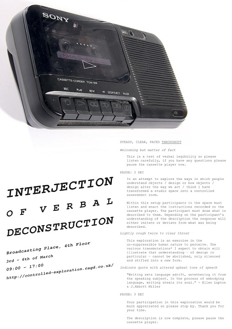
Poster
Inspired by the interplay of photography and typography, particularly in the 1960â??s ad campaigns of Volkswagen, I decided to feature a photograph of the cassette player used for this project. It was not my initial intention to advertise the object displayed, and I believe it does not appear to act in this way; the use of photography was an attempt to advertise and attract attention through visual appeal. Photography imitates reality through its realism therefore catching eyes; I believe the role of photography within commercial design is paramount for an effective engagement with a spectator.
For this project, participants enter the controlled exploration space, as used in my Controlled Exploration project, to then listen to a recording of me reading from a designed script. I used Courier New as this is the compulsory typeface for all film scripts. Although most spectators without a film background would be unfamiliar with this connection, it was not my intention to be overt about this link. An example of the designed Verbal Scripts created for this project features in the lower right of this poster as a description of this project.
The lower left of the poster features the project and the details of the event. I was inspired by the slanting typeface for the Martian Museum of Terrestrial Art (2008) at the Barbican to create a similar effect with the project title. Although purely aesthetic I believe this typographic positioning borders on the threshold of verbal expression. I am now reminded of the expressive use of typography in 1950s advertisements. There is a sense of personality and an attempt to connect with your spectators, all through the expressiveness of the type.
Like the poster created for A Controlled Exploration into Graphic Deconstruction: Part 2. this poster was in-keeping with the formalities used in the previous posters. To reflect a connection between all projects I wanted to keep certain attributes the same. I felt a need to do this to reflect a consistency in project intentions. Although each project is different, they all explore and stem from a similar background of exploring graphic communication.
